Curated Comforts
How a home & comfort brand lifted conversion 34% and cut cart abandonment 28%.
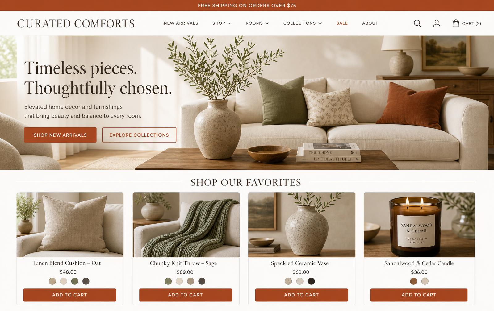
A warm, editorial e-commerce storefront for a home & comfort brand — built to turn browsing into confident buying with fast discovery, a frictionless cart, and a trust-forward checkout.
What the storefront does
Six pieces work together to turn a beautiful catalog into a store that converts — from first impression to completed checkout.
Editorial merchandising
A warm, magazine-style storefront with lifestyle hero imagery, curated collections, and room-based browsing that makes discovery feel like flipping through a catalog.
Fast product discovery
Instant category filtering, wishlists, ratings, and color swatches let shoppers narrow to the right piece in seconds — no page reloads.
Frictionless cart
A persistent mini-cart with live subtotal and a free-shipping progress nudge keeps momentum high and lifts average order value.
Streamlined checkout
A short, trust-forward checkout with saved details and multiple payment options removes the friction where most sales are lost.
Trust & delivery signals
Free-shipping thresholds, secure-checkout badges, and easy returns are surfaced exactly where hesitation happens.
Mobile-first performance
Responsive layouts, lazy-loaded imagery, and a sub-1.5s time-to-interactive keep the majority mobile audience shopping smoothly.
Explore the live storefront
A working slice of the store. Filter the catalog, favorite pieces, and add products to a real cart — watch the subtotal and free-shipping progress respond in real time.
CURATED
COMFORTS
Timeless pieces. Thoughtfully chosen.
Elevated décor to bring warmth, beauty, and comfort into every corner of your home.
Linen Blend Cushion — Oat
Chunky Knit Throw — Sage
Speckled Ceramic Vase
Sandalwood & Cedar Candle
Velvet Lumbar Cushion — Rust
Waffle Cotton Throw — Cream
Stoneware Mug Set (4)
Amber Glass Soy Candle
Your bag
0 itemsAdd $75.00 more for free shipping
Free shipping over $75
Fast, tracked delivery on qualifying orders.
Secure checkout
Encrypted payments with buyer protection.
30-day returns
Not in love? Send it back, no fuss.
From challenge to outcome
The Problem
What We Learned
The Strategy
How It Was Built
Accessibility
The Impact
What I Carry Forward
Structure, flow & fidelity
How the product was organised, the path a user actually takes through it, and how the work travelled from scratch wireframes to a working prototype.
Information architecture
Discover
- Home & editorial
- Collections
- Search & filters
- Recommendations
Product
- Gallery
- Materials & care
- Reviews
- Delivery estimate
Cart & checkout
- Cart drawer
- Shipping
- Payment
- Order review
Account
- Orders & tracking
- Wishlist
- Returns
- Preferences
User flow of the core task
- Step 01
Land & browse
Editorial entry points route shoppers into a collection rather than a raw grid.
- Step 02
Filter to a shortlist
Filters map to how people actually shop the category, not to the database schema.
- Step 03
Evaluate a product
Imagery, materials and delivery certainty answer the objection before it forms.
- Step 04
Check out
A short, interruption-free checkout with visible totals at every step.
- Step 05
Track the order
Post-purchase tracking and easy returns drive the repeat visit.
Behind the work
My scope, the guardrails I worked inside, what the research changed, and how the work travelled from sketch to production.
My role & scope
Design lead for the storefront experience: merchandising research, browse and product-detail architecture, the imagery and content system, and the checkout flow. Collaborated with the founder, a copywriter and two engineers.
Constraints & guardrails
- Small catalogue with limited photography budget — the system had to look rich without volume.
- No dedicated content team, so templates had to stay easy for the founder to fill.
- Mobile-majority traffic on a lean performance budget.
- Third-party checkout limited how far the final step could be customised.
What research changed
- Session recordings: shoppers bounced from the product page when imagery repeated across variants.
- Interviews showed buyers wanted material and care detail before price — trust preceded comparison.
- Analytics found small imagery correlated with lower add-to-cart on mobile.
The pivot
An early grid-heavy layout maximised products per screen but suppressed engagement. We traded density for larger, distinct imagery and story-led product detail, which read as considered rather than transactional.
UX metric → business impact
Merchandising wireframes and a content model defining what every product page must carry.
Prototype of browse-to-checkout with responsive imagery rules and empty-catalogue states.
Live storefront with the imagery system, story-led product pages and streamlined checkout.
Retrospective
A/B test the density trade-off rather than deciding it from qualitative signals alone.
For small catalogues, restraint outperforms density — fewer, better-told products build the trust that drives the first purchase.
“We were terrified that making it faster would make it feel cheap. It got quicker and warmer at the same time — that was the whole win.”